9 Making maps with R
These exercises rely on a new object, africa.
Create it using the world and worldbank_df datasets from the spData package as follows:
library(spData)
africa = world |>
  filter(continent == "Africa", !is.na(iso_a2)) |>
  left_join(worldbank_df, by = "iso_a2") |>
  select(name, subregion, gdpPercap, HDI, pop_growth) |>
  st_transform("ESRI:102022") |>
  st_make_valid() |>
  st_collection_extract("POLYGON")
We will also use zion and nlcd datasets from spDataLarge:
zion = read_sf((system.file("vector/zion.gpkg", package = "spDataLarge")))
nlcd = rast(system.file("raster/nlcd.tif", package = "spDataLarge"))
E1. Create a map showing the geographic distribution of the Human Development Index (HDI) across Africa with base graphics (hint: use plot()) and tmap packages (hint: use tm_shape(africa) + ...).
- Name two advantages of each based on the experience.
- Name three other mapping packages and an advantage of each.
- Bonus: create three more maps of Africa using these three other packages.
# graphics
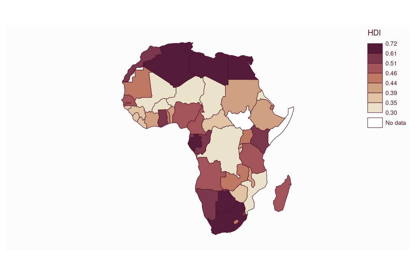
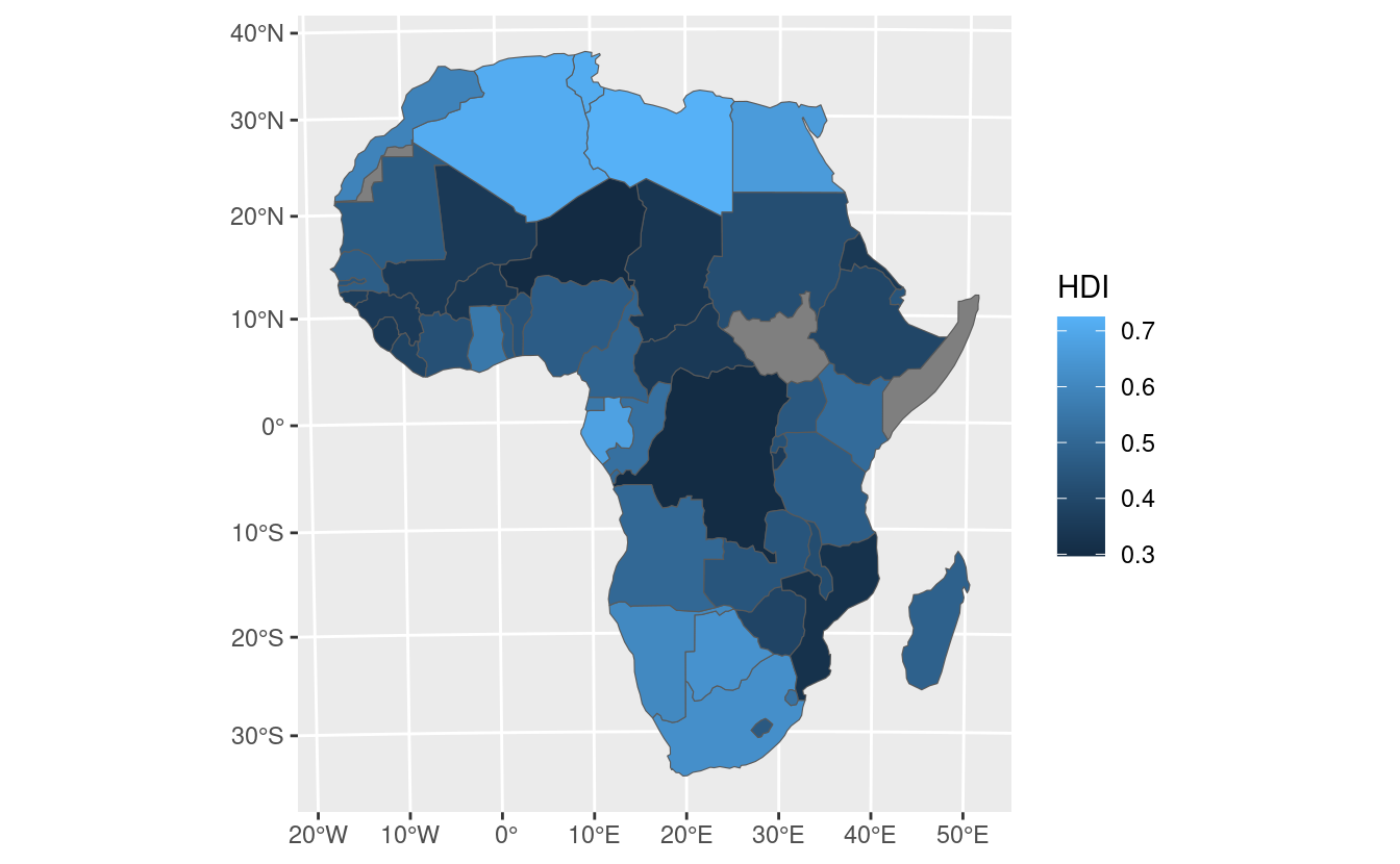
plot(africa["HDI"])
# # tmap
# remotes::install_github("r-tmap/tmap")
library(tmap)
tm_shape(africa) +
tm_polygons("HDI")
# ggplot
library(ggplot2)
ggplot() +
geom_sf(data = africa, aes(fill = HDI))
# ggplotly
library(plotly)
#>
#> Attaching package: 'plotly'
#> The following object is masked from 'package:ggplot2':
#>
#> last_plot
#> The following object is masked from 'package:stats':
#>
#> filter
#> The following object is masked from 'package:graphics':
#>
#> layout
g = ggplot() +
geom_sf(data = africa, aes(fill = HDI))
ggplotly(g)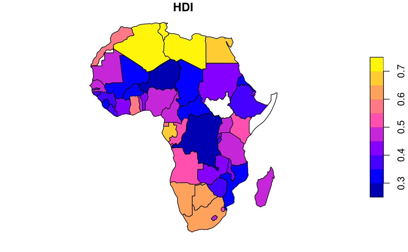
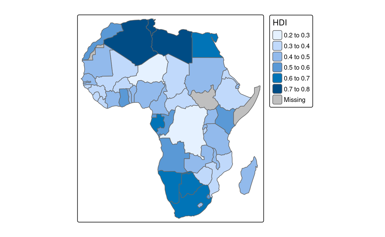
E2. Extend the tmap created for the previous exercise so the legend has three bins: “High” (HDI above 0.7), “Medium” (HDI between 0.55 and 0.7) and “Low” (HDI below 0.55).
Bonus: improve the map aesthetics, for example by changing the legend title, class labels and color palette.
library(tmap)
tm_shape(africa) +
  tm_polygons("HDI",
              fill.scale = tm_scale_intervals(breaks = c(0, 0.55, 0.7, 1),
                                              labels = c("Low", "Medium", "High"),
                                              values = "-viridis"),
fill.legend = tm_legend(title = "Human Development Index")) 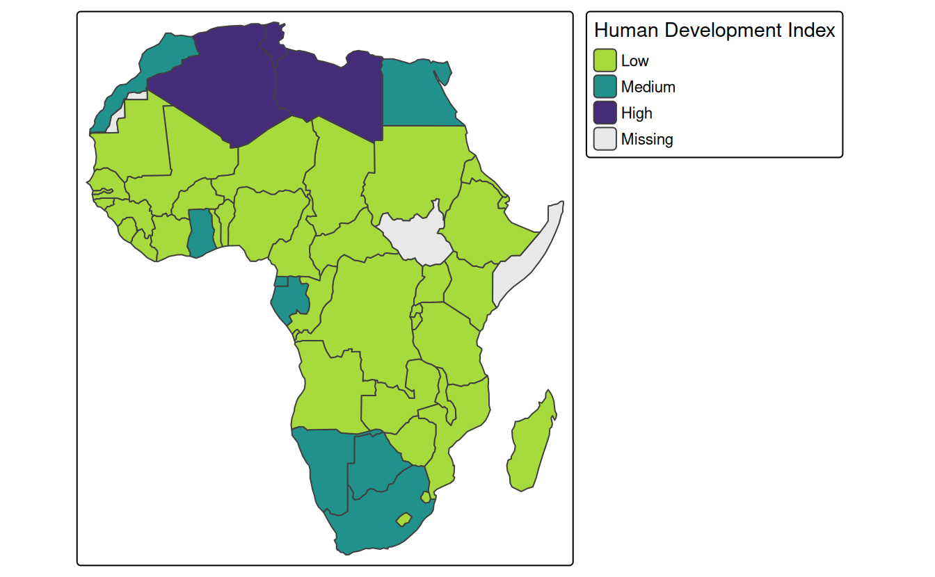
E3. Represent africa’s subregions on the map.
Change the default color palette and legend title.
Next, combine this map and the map created in the previous exercise into a single plot.
asubregions = tm_shape(africa) +
  tm_polygons("subregion",
              fill.scale = tm_scale_categorical(values = "Set3"),
              fill.legend = tm_legend(title = "Subregion:"))
ahdi = tm_shape(africa) +
  tm_polygons("HDI",
              fill.scale = tm_scale_intervals(breaks = c(0, 0.55, 0.7, 1),
                                              labels = c("Low", "Medium", "High"),
                                              values = "-viridis"),
              fill.legend = tm_legend(title = "Human Development Index:"))
tmap_arrange(ahdi, asubregions)
#> [cols4all] color palettes: use palettes from the R package cols4all. Run
#> `cols4all::c4a_gui()` to explore them. The old palette name "Set3" is named
#> "brewer.set3"
#> Multiple palettes called "set3" found: "brewer.set3", "hcl.set3". The first one, "brewer.set3", is returned.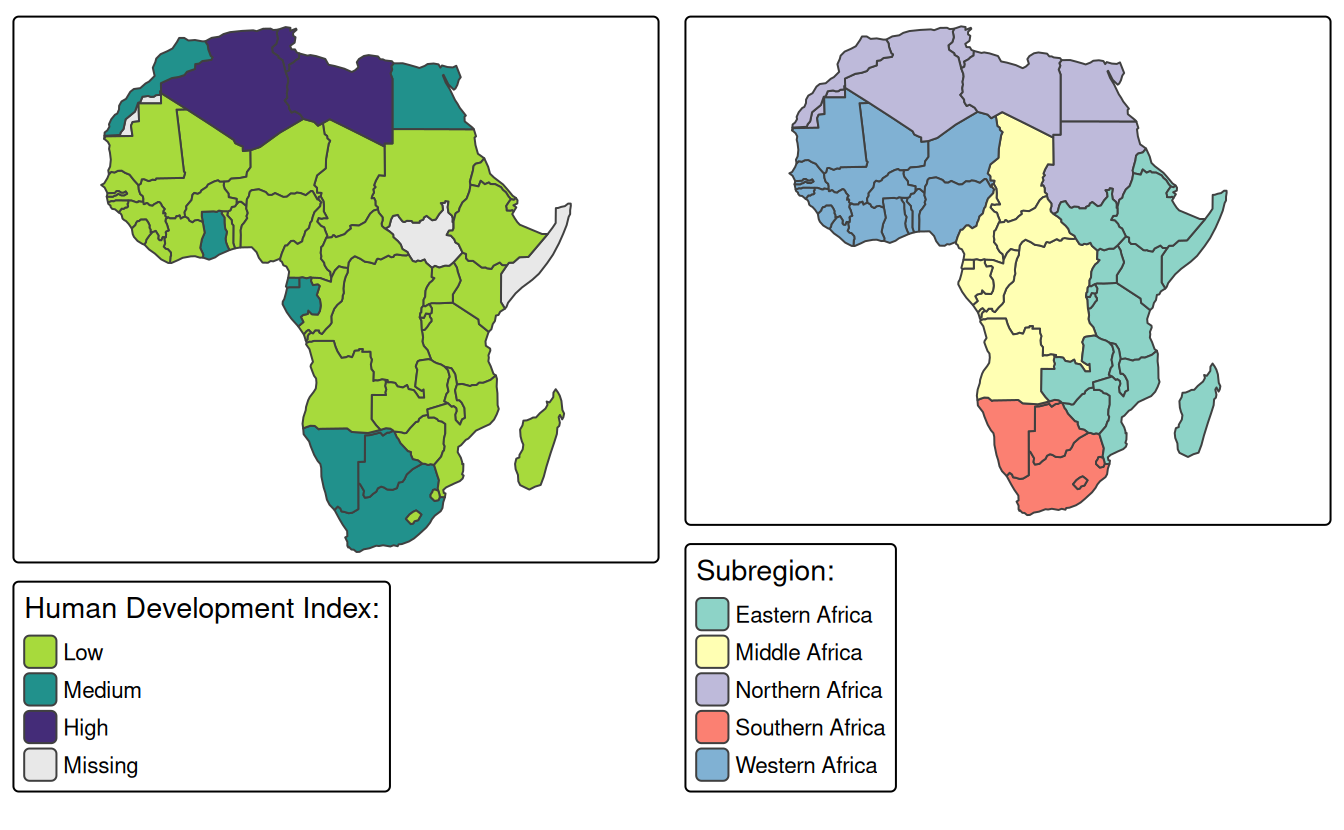
E4. Create a land cover map of Zion National Park.
- Change the default colors to match your perception of the land cover categories
- Add a scale bar and north arrow and change the position of both to improve the map’s aesthetic appeal
- Bonus: Add an inset map of Zion National Park’s location in the context of the state of Utah. (Hint: an object representing Utah can be subset from the
us_statesdataset.)
tm_shape(nlcd) +
  tm_raster(col.scale = tm_scale_categorical(values = c("#495EA1", "#AF5F63", "#EDE9E4",
                                                        "#487F3F", "#EECFA8", "#A4D378",
                                                        "#FFDB5C", "#72D593"), levels.drop = TRUE)) +
  tm_scalebar(bg.color = "white", position = c("left", "bottom")) +
  tm_compass(bg.color = "white", position = c("right", "top")) +
  tm_layout(legend.position = c("left", "top"), legend.bg.color = "white")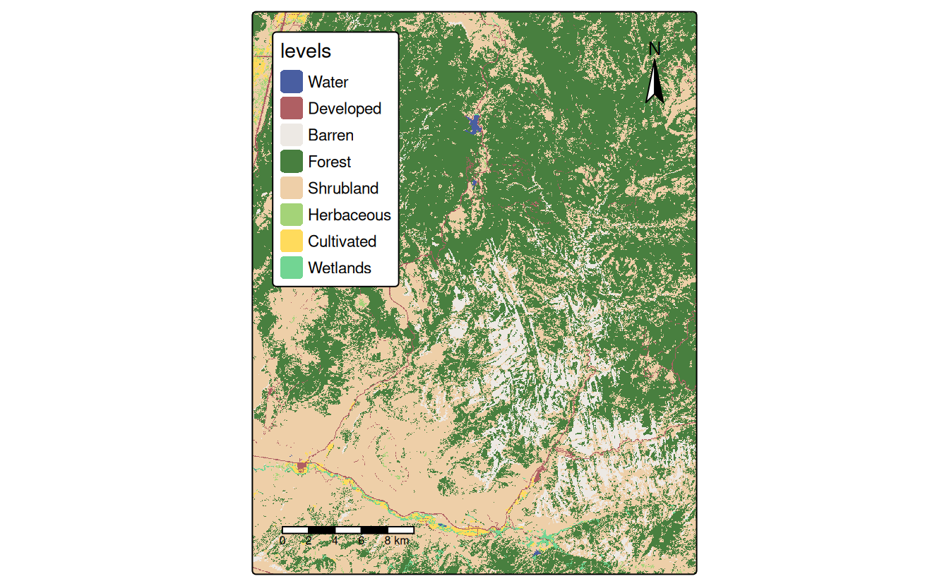
# Bonus
utah = subset(us_states, NAME == "Utah")
utah = st_transform(utah, st_crs(zion))

zion_region = st_bbox(zion) |>
  st_as_sfc()

main = tm_shape(nlcd) +
  tm_raster(col.scale = tm_scale_categorical(values = c("#495EA1", "#AF5F63", "#EDE9E4",
                                                        "#487F3F", "#EECFA8", "#A4D378",
                                                        "#FFDB5C", "#72D593"), levels.drop = TRUE)) +
  tm_scalebar(bg.color = "white", position = c("left", "bottom")) +
  tm_compass(bg.color = "white", position = c("right", "top")) +
  tm_layout(legend.position = c("left", "top"), legend.bg.color = "white")

inset = tm_shape(utah) +
  tm_polygons() +
  tm_text("UTAH", size = 3) +
  #tm_shape(zion) +
  #tm_polygons(col = "red") +
  tm_shape(zion_region) +
  tm_borders(col = "red") +
  tm_layout(frame = FALSE)

library(grid)
#>
#> Attaching package: 'grid'
#> The following object is masked from 'package:terra':
#>
#>     depth
norm_dim = function(obj){
    bbox = st_bbox(obj)
    width = bbox[["xmax"]] - bbox[["xmin"]]
    height = bbox[["ymax"]] - bbox[["ymin"]]
    w = width / max(width, height)
    h = height / max(width, height)
    return(unit(c(w, h), "snpc"))
}
main_dim = norm_dim(zion)
ins_dim = norm_dim(utah)

main_vp = viewport(width = main_dim[1], height = main_dim[2])
ins_vp = viewport(width = ins_dim[1] * 0.4, height = ins_dim[2] * 0.4,
                  x = unit(1, "npc") - unit(0.5, "cm"), y = unit(0.5, "cm"),
                  just = c("right", "bottom"))

grid.newpage()
print(main, vp = main_vp)
pushViewport(main_vp)
print(inset, vp = ins_vp)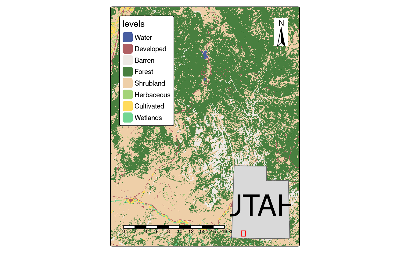
E5. Create facet maps of countries in Eastern Africa:
- With one facet showing HDI and the other representing population growth (hint: using variables
HDIandpop_growth, respectively) - With a ‘small multiple’ per country
ea = subset(africa, subregion == "Eastern Africa")
#1
tm_shape(ea) +
  tm_polygons(c("HDI", "pop_growth"))
#2
tm_shape(ea) +
  tm_polygons() +
  tm_facets_wrap("name")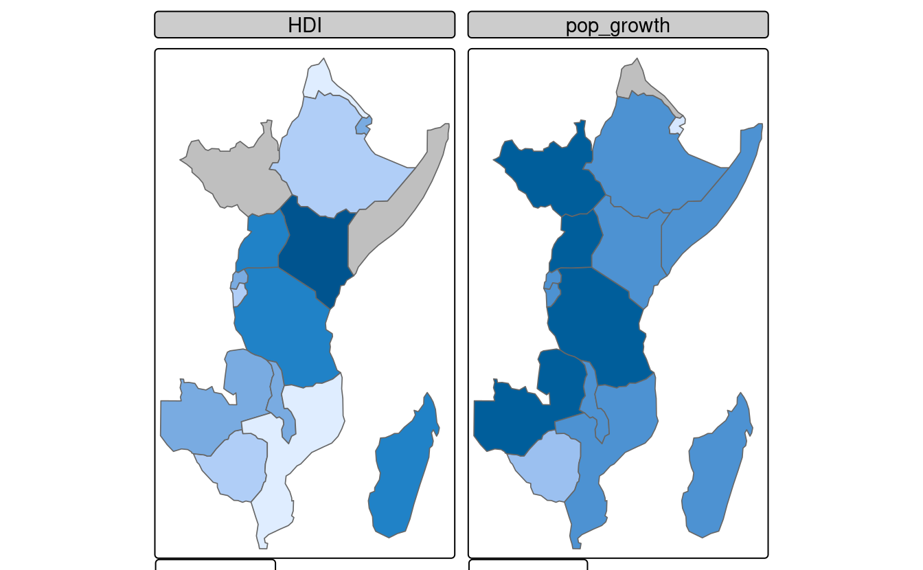
E6. Building on the previous facet map examples, create animated maps of East Africa:
- Showing each country in order
- Showing each country in order with a legend showing the HDI
tma1 = tm_shape(ea) +
  tm_polygons() +
  tm_facets(by = "name", nrow = 1, ncol = 1)
tmap_animation(tma1, filename = "tma2.gif", width = 1000, height = 1000)
browseURL("tma1.gif")

tma2 = tm_shape(africa) +
  tm_polygons(fill = "lightgray") +
  tm_shape(ea) +
  tm_polygons(fill = "darkgray") +
  tm_shape(ea) +
  tm_polygons(fill = "HDI") +
  tm_facets(by = "name", nrow = 1, ncol = 1)
tmap_animation(tma2, filename = "tma2.gif", width = 1000, height = 1000)
browseURL("tma2.gif")
E7. Create an interactive map of HDI in Africa:
- With tmap
- With mapview
- With leaflet
- Bonus: For each approach, add a legend (if not automatically provided) and a scale bar
# tmap
tmap_mode("view")
tm_shape(africa) + tm_polygons("HDI") + tm_scalebar()
# mapview
mapview::mapview(africa["HDI"])
# leaflet
africa4326 = st_transform(africa, "EPSG:4326")
library(leaflet)
pal = colorNumeric(palette = "YlGnBu", domain = africa4326$HDI)
leaflet(africa4326) |>
  addTiles() |>
  addPolygons(stroke = FALSE, smoothFactor = 0.2, fillOpacity = 1, color = ~pal(HDI)) |>
  addLegend("bottomright", pal = pal, values = ~HDI, opacity = 1) |>
  addScaleBar()
E8. Sketch on paper ideas for a web mapping application that could be used to make transport or land-use policies more evidence-based:
- In the city you live, for a couple of users per day
- In the country you live, for dozens of users per day
- Worldwide for hundreds of users per day and large data serving requirements
Ideas could include identification of routes where many people currently drive short distances, ways to encourage access to parks, or prioritization of new developments to reduce long-distance travel.
At the city level a web map would be sufficient.
A the national level a mapping application, e.g., with shiny, would probably be needed.
Worldwide, a database to serve the data would likely be needed. Then various front-ends could plug in to this.
E9. Update the code in coffeeApp/app.R so that instead of centering on Brazil the user can select which country to focus on:
- Using
textInput() - Using
selectInput()
The answer can be found in the shinymod branch of the geocompr repo: https://github.com/Robinlovelace/geocompr/pull/318/files
You create the new widget and then use it to set the center.
Note: the input data must be fed into the map earlier to prevent the polygons disappearing when you change the center this way.
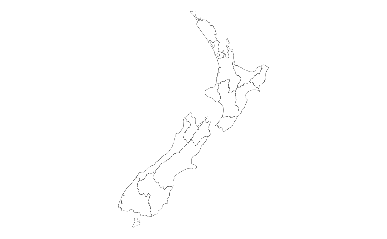
E10. Reproduce Figure 9.1 and Figure 9.7 as closely as possible using the ggplot2 package.
library(ggplot2)
ggplot() +
geom_sf(data = nz, color = NA) +
coord_sf(crs = st_crs(nz), datum = NA) +
theme_void()
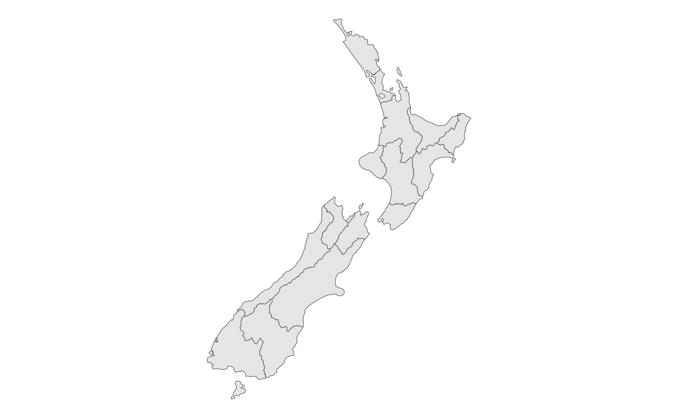
ggplot() +
geom_sf(data = nz, fill = NA) +
coord_sf(crs = st_crs(nz), datum = NA) +
theme_void()
ggplot() +
geom_sf(data = nz) +
coord_sf(crs = st_crs(nz), datum = NA) +
theme_void()
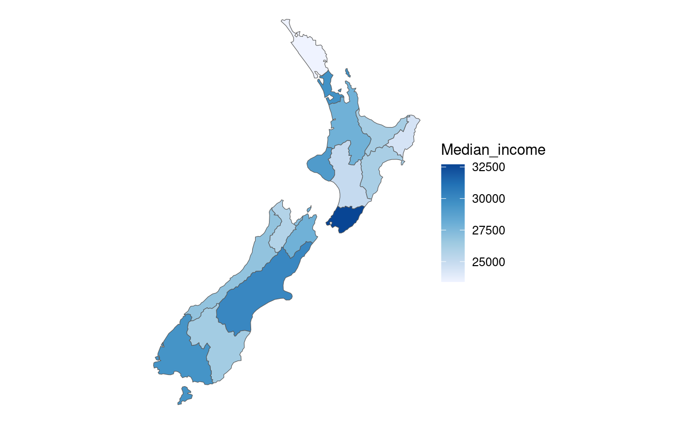
# fig 9.7
ggplot() +
geom_sf(data = nz, aes(fill = Median_income)) +
coord_sf(crs = st_crs(nz), datum = NA) +
scale_fill_distiller(palette = "Blues", direction = 1) +
theme_void()
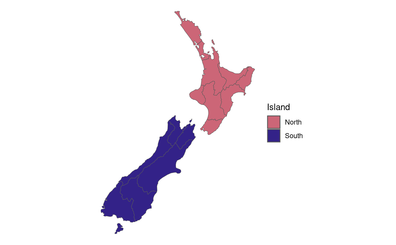
ggplot() +
geom_sf(data = nz, aes(fill = Island)) +
coord_sf(crs = st_crs(nz), datum = NA) +
scale_fill_manual(values = c("#CC6677", "#332288")) +
theme_void()
E11. Join us_states and us_states_df together and calculate a poverty rate for each state using the new dataset.
Next, construct a continuous area cartogram based on total population.
Finally, create and compare two maps of the poverty rate: (1) a standard choropleth map and (2) a map using the created cartogram boundaries.
What is the information provided by the first and the second map?
How do they differ from each other?
tmap_mode("plot")
#> ℹ tmap modes "plot" - "view"
#> ℹ toggle with `tmap::ttm()`
library(cartogram)
#>
#> Attaching package: 'cartogram'
#>
#> The following object is masked from 'package:terra':
#>
#>     cartogram
# prepare the data
us = st_transform(us_states, "EPSG:9311")
us = left_join(us, us_states_df, by = c("NAME" = "state"))
# calculate a poverty rate
us$poverty_rate = us$poverty_level_15 / us$total_pop_15
# create a regular map
ecm1 = tm_shape(us) +
  tm_polygons("poverty_rate", fill.legend = tm_legend(title = "Poverty rate"))
# create a cartogram
us_carto = cartogram_cont(us, "total_pop_15")
ecm2 = tm_shape(us_carto) +
  tm_polygons("poverty_rate", fill.legend = tm_legend(title = "Poverty rate"))
# combine two maps
tmap_arrange(ecm1, ecm2)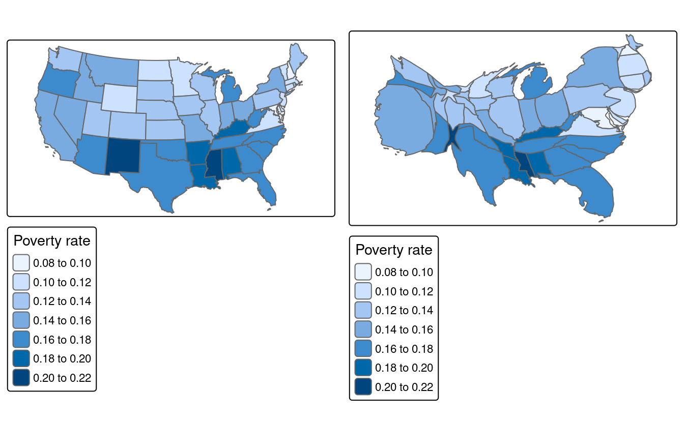
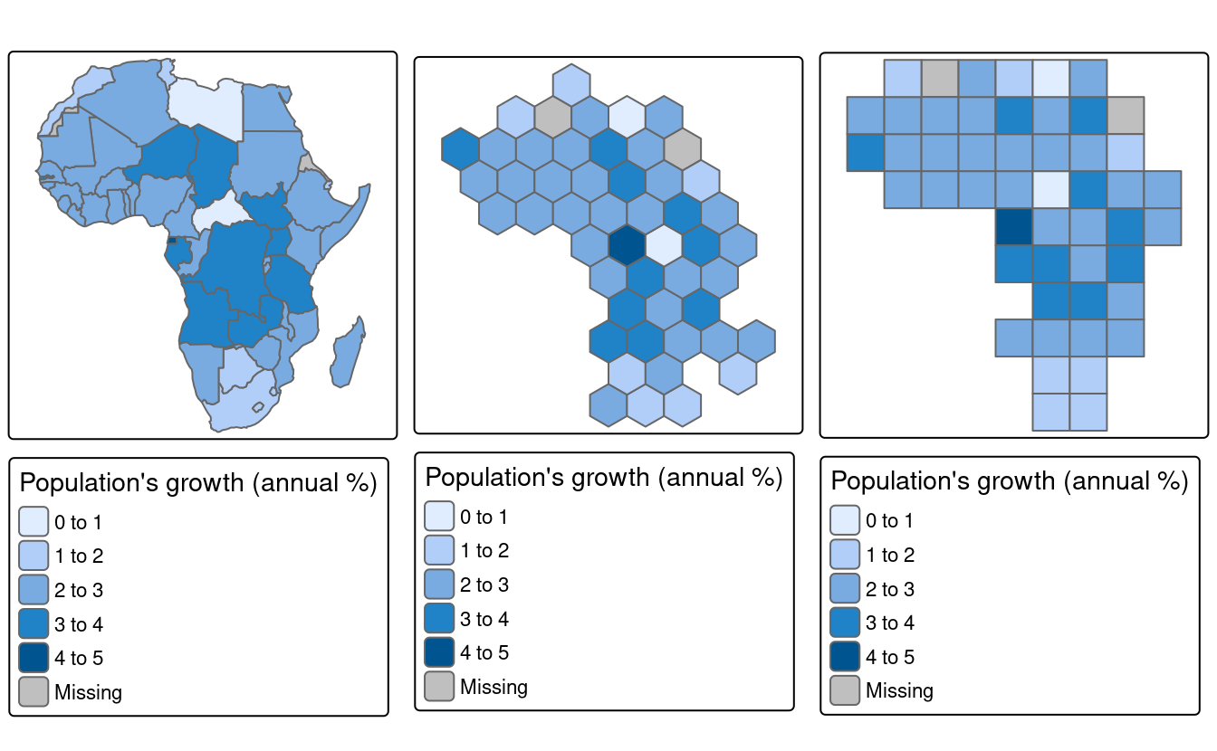
E12. Visualize population growth in Africa. Next, compare it with the maps of a hexagonal and regular grid created using the geogrid package.
library(geogrid)

hex_cells = calculate_grid(africa, grid_type = "hexagonal", seed = 25, learning_rate = 0.03)
africa_hex = assign_polygons(africa, hex_cells)

reg_cells = calculate_grid(africa, grid_type = "regular", seed = 25, learning_rate = 0.03)
africa_reg = assign_polygons(africa, reg_cells)

tgg1 = tm_shape(africa) +
  tm_polygons("pop_growth", fill.legend = tm_legend(title = "Population's growth (annual %)"))
tgg2 = tm_shape(africa_hex) +
  tm_polygons("pop_growth", fill.legend = tm_legend(title = "Population's growth (annual %)"))
tgg3 = tm_shape(africa_reg) +
  tm_polygons("pop_growth", fill.legend = tm_legend(title = "Population's growth (annual %)"))

tmap_arrange(tgg1, tgg2, tgg3)